PHRC026 : Dedication of the Bakchoi to Eumenes II, Pergamon - Mysia (158-133 BC) Dedication
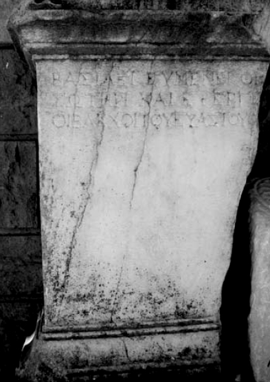
This finely inscribed altar was posthumously dedicated to Eumenes II by the cultic association of the Bakchoi. Its original location was probably the precinct of Athena on the acropolis, a prominent space for the royal representation and identity of the Attalids. The inscription testifies to the appropriation by a private religious group of the official ideological link associating the Attalid dynasty with Dionysos. Moreover, the quality of the inscription as well as the use of the rare literary epiclesis Euastes for Dionysos confirm that the Bakchoi were members of the Pergamon elite, perhaps enjoying a direct link with the royal court and with its cultural and religious life.
Permanent ID http://s.phrc.it/phrc026
Images:
Photo 1: Photo of the altar, from Bielfeldt 2010, 157, fig. 16
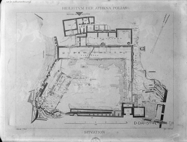
Photo 2: Plan of the ruins of the sanctuary of Athena; from Arachne.dainst.org
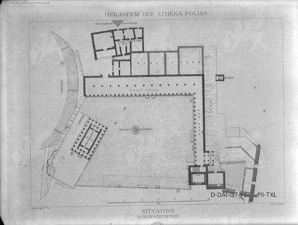
Photo 3: Plan of the sanctuary of Athena, reconstruction; from Arachne.dainst.org
Permanent ID http://s.phrc.it/phrc026
Images:
Photo 1: Photo of the altar, from Bielfeldt 2010, 157, fig. 16
Photo 2: Plan of the ruins of the sanctuary of Athena; from Arachne.dainst.org
Photo 3: Plan of the sanctuary of Athena, reconstruction; from Arachne.dainst.org